Kids Atelier
Modern Website & Customer UX Overhaul
![Web-Screens_-Grid-[remix].gif](https://static.wixstatic.com/media/6d8b2d_69f3c5d28652472fa14509391804cc78~mv2.gif/v1/fill/w_720,h_450,al_c,pstr/Web-Screens_-Grid-%5Bremix%5D_gif.gif)
NOV 2024- SEP 2025
Overview 📝
Kids Atelier is one of the largest storefronts that highlight Kid's Couture and Fashion. Despite being one of the largest kids-wear stores, their own website / e-commerce has been lacking. How easy and intuitive it is to find products and browse is of the most important step, when it comes to e-commerce & retail. Hence my main focus was the site's menu and page design.
Methodologies : Research, Competitive Audit, Metrics Analysis, Taxonomy Design, A/B Testing, Accessibility Analysis, Design Sprints
*actual metrics withheld to comply with NDA agreement, please ask about it.
Lead UI/UX Designer
Digital Developer
Project Strategist
📋Role(s)
Figma, Adobe Photoshop, Jira,
Adobe Illustrator, Notion
🔧Tools
4
👥Team Size
Redesign Outcomes 📈
121% Increase
In average usability score
(37 → 81)
125% Increase
In average menu to purchase sales
(8 → 18)
32% Increase
Returning E-Commerce Customers
(191 → 262)
DISCOVERY
RESEARCH | COMPETITIVE AUDIT | METRICS ANALYSIS | A/B TESTING
Context & The Problem(s) ⚠️
Founded in 2010, Kids Atelier is one of the largest marketplaces that features luxury kids-wear, with 9 physical store locations and valued at 7.4 Million USD. Kids Atelier needed an update to it's website as well as the customer experience within the menus. Although Kids Atelier was already an established brand and store, their venture into e-commerce was unoptimized, leading to me embarking on the startup journey with them.
My task was to update the website's layout, and improve pages & menu exploration and bring it to the competitive standard.
🚧Constraints 🚧
Shopify
While initial layouts were designed in Figma, translating it into the Shopify Framework proved to be challenging. Balancing custom-code and overall website speed.
Target Audience
This was one of the first times I've designed for a particularly niche / specific audience in mind. Which was Parents & Grandparents over the age of 30, that shop couture brands.
Live Website
This was an active website and our boss wanted to see results. Navigation was the highest priority and would see weekly updates, while overall design was monthly, and pushed slower.
Audit + Competitive Audit

With an end-goal in mind, and problem identified, I began my research with an in-house site audit, as well as a competitive audit. I went through 12 competitive sites, as well as the old site design with a focus on taxonomy, website elements, & page layouts.
Summary of Findings
-
ALL sites utilize their submenu's to their fullest extent, breaking it down by kids gender and category, and a combination of everything baby.
-
To break monotony, 8 out of 12 often utilize web banners as well to add visual fidelity to the menu search.
-
7 out of 12, they avoid the "shopify" store look of slideshows and products, to give off a more high-end shopping experience utilizing instead high quality custom graphics.
-
10 out of 12 websites include a unique way to display products beyond just a simple image box with text below.
12 Competitors Analyzed

As for our site itself it was lacking proper menu navigation, and outdated page designs. After a back-end audit, 26 of 100 users explored the site and purchased, and 8 of 100 users purchased while exploring and using the menu.
Old Design
Iterative A/B Usability Testing : Navigation 📊
I decided to iterate here with two iterative taxonomical menus of how the information was organized. I ran both moderated & unmoderated tests by updating the menu taxonomy on the live site over the course of 5 days each (15 days total), recording information with the built-in Shopify analytics and menu usage. The goal was to reduce time taken, and make exploring easier.
Unmoderated tests utilized the built-in Shopify Analytics and another app to track session data, while moderated tests were given a task to find 2 specific products, and 3 loose idea products without using the Designers Menu, and it was timed to measure ease of access. Each test used a different set of 10 Moderated Users (30 Total)
These are the products and loose idea products based on my audit, and shopify statistics.
-
Product 1 : A BOSS T-Shirt for Boys
-
Product 2 : A Dress on Sale For Girls
-
Product 3 : Browse the shoes for a pair of Loafers for a boy
-
Product 4 : Browse One-Piece for Baby Girls that are 4 Months Old (4M)
-
Product 5 : Browse New Products for Unisex Baby
Control : Original
The original desired to be simplistic, with the designer as the menu to shop by designer, then each over-arching category (gender and kid / baby) with the filters used instead. No changes have been made.
Test A : By Type
Test B utilized organized by type, including all types of products under the hierarchy as a submenu below each L1 (Menu Item). Separating into main categories (tops), and sub categories (shirts).
Test B : By Collection
Test C utilized the individually made collections instead, and pre-making filters for specific age groups to also maintain in-stock products. It also includes image banners within the menus.


Test A , By Type Included that share a tag with the main one.
After Test B, 6th 7th etc are placeholder text
Control Findings ⭐
-
8,879 sessions were held during the control period. 8,869 unmoderated, 10 moderated.
-
4,621 (52%) sessions interacted with the main menu / menu bar.
-
361 (8%) of sessions that interacted with the main menu bar successfully added to cart.
-
Among those 8%, 255 (71%) of those came from the designer menu which does include a submenu to organize.
-
Moderated Test Results : 21/50 items successfully found
-
Although moderated users eventually found what they were looking for but 17 of the moderated sessions took 5-7 minutes to find it.
Test A Findings ⭐
-
9,112 sessions were held during the control period. 9,110 unmoderated, 10 moderated.
-
4,927 (54%) sessions interacted with the main menu / menu bar. 10/10 moderated used the menu bar.
-
503 (10%) of sessions that interacted with the main menu bar successfully added to cart.
-
Moderated Test Results : 33/50 items successfully found.
-
This did not fix the issue of showing products that were out of stock, since pulling from the filtered list.
-
Average time took for moderated sections was around 3-4 minutes.
-
Test B Findings ⭐
-
8530 sessions were held during the control period. 8520 unmoderated, 10 moderated.
-
4,961 (58%) sessions interacted with the main menu / menu bar. 10/10 moderated used the menu bar.
-
909 (18%) of sessions that interacted with the main menu bar successfully added to cart.
-
Moderated Test Results : 45/50 items successfully found.
-
-
Fixed issue of not showing products, since it utilized collections over filters.
-
Average time decreased to 2-3 minutes.
-
-
DEFINE
ACCESSIBILITY ANALYISIS | DESIGN SPRINTS | TAXONOMY DESIGN
Observations & Recommendations (Audit to control to Test A to Test B, & After)
-
Even after all the tests finding new UNISEX baby products was IMPOSSIBLE. A task I was able to accomplish on multiple competitor sites.
-
I found that rather than having the split between Baby Boy & Baby Girl Products both including Unisex, competitors combined both of them with Baby Boy & Baby Girl as types and collections instead.
-
-
Finding the shoes proved to be the hardest one, and also based on sessions that looked for shoes, they were left un-added to cart.
-
Add Shoes to the main menu.
-
-
Sale & New should be explorable, as product 2 & 5 took longer than the other products by a considerable margin.
-
Add looser taxonomy based on inventory and clicks as submenu items.
-
-
By Age felt the least intuitive, while it was now only 2-3 clicks away, adding it to the menu would only make it 1-2 clicks away, improving efficiency.
-
To increase and make it more intuitive, repeated items on the menus to submenus were allowed, such as having shoes by gender and under each gender having a by shoes option was both the competitive standard and increased overall clickthrough rate
-
During Test A, some item types went completely unclicked while something similar was.
-
Combined some types together into one element / collection i.e Tops, Tees, & Polos
-
-
From the competitive Audit, they also included a set of collections that over encompassed the main menu item, e.g New Boys Clothes, or New by Designer
-
Leftmost sorted collections added for a more broader appeal.
-
-
After each test I asked to give it a usability score, these are the average scores.
-
Control : 37
-
Test A : 45
-
Test B : 62
-
All moderated sessions gave feedback as well towards the visual design, describing that while more functional than ever, lacked character, and was also too spaced out. This will be addressed as we go into the design portion.
Taxonomy Design

The original Taxonomy had the intent to give them the general overarching categories, shopping by Designers, New, Sale, Shoes, and Age/Gender, utilizing filters on the product listing pages to build the search. While it did work for some moderated testing, statistics showed a high click-off rate after the fact. Usage only used the designers and sale tab, with menu use sitting at around 35% use.

The first variation helped users find what they were looking for more quickly, particularly those who preferred to browse. The designer list remained mostly unchanged, but overall menu engagement increased by about 59%. While this was a clear improvement, small inconsistencies and repeated information made the experience feel less intuitive. Certain areas could also be streamlined, such as clarifying the distinction between Outfit Sets and Outfits, and better grouping low-stock items to reduce clutter.
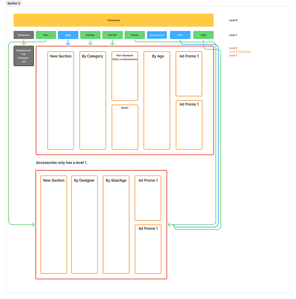
The second variation performed significantly better. Instead of relying only on broad categories, it drew from competitor research to focus on how users naturally search. The updated structure introduced options such as New Pieces, Specific Collections, and By Size/Age, giving users more direct paths to what they wanted. Promotional image ads were also added to showcase featured collections or designers, creating a more visually engaging experience. As a result, usage increased to 78%, supported by improved collection page linking, the addition of popular search highlights, and the inclusion of top-performing menu items like New and Designer within the subcategories.
DESIGN & SCREENSHOTS
Menu Design

Here is the final design of the menu, utilizing a very simple and clean Sans-Serif Font, and updated visuals, accessibility, and animations to match. Such as deliberate lines that help separate the header of a category over the subcategories, lines, a signature yellow hue that lines with the brand, colored text, and photo ads for some visual flare where appropriate.
Page Design(s) & Graphics
To match with the new menu, similar to the menu ads, I continued to update website graphics to match, as the previous layout for a majority of elements worked well. To work well with the sans-serif font, and decided to use Montserrat, which as a clean typeface in many cases, and great for banners.


Unique Element : Designer Gallery
I also explored a new way to showcase a key part of the homepage experience. Since the Designers tab was one of the most frequently used sections in the main menu, I reimagined how it could be presented. Instead of listing all designers, I featured the top 14 most popular brands using curated campaign imagery. This created a visually striking gallery that not only highlighted key designers but also gave the homepage a stronger sense of identity and visual rhythm. Utilizing both front-end coding & the Shopify Framework.

REFLECTION
Kids Atelier Going Forward...
-
Kids Atelier now has their framework setup and is set to launch officially sometime in Q4 / the FW26 Season.
-
The Case Study was a small testing period that utilized live data, afterwards was reverted back so the team could optimize everything afterwards.
-
-
The framework is also easily adaptable with proper HTML & CSS implemented for a clean look, that's also both intuitive yet editable.
-
The new design breaks away from the cheap Shopify status quo, and is much closer to the competitive standard.
Personal Reflection
1. E-commerce navigation plays a critical role in shaping the overall UI/UX experience. A well-structured navigation system supports user goals, minimizes cognitive load, and enables efficient product discovery—all key factors in reducing drop-off and improving conversion. After optimizing our navigation through data-driven design and user behavior analysis, we observed a 121% increase in usability score, a 125% lift in menu-to-purchase sales, and a 32% rise in returning customers. These results highlight how intentional information architecture and navigation design directly translate to measurable business impact and stronger user satisfaction.
2. I'm extremely happy that I was able to create both a framework, and try live A/B testing and seeing actual results. I do think the overall design & brand development could use a bit of work, such as the optimal type-face being chosen due to website load-speed, I would've loved to use a more dynamic and wide font. But overall working within limitations is a challenge I'm proud to have conquered.
Thanks for Reading !
During this role, I've also had the opportunity to learn about e-mail marketing, instagram ads, and general marketing. I was also able to practice website management, website accessibility (SEO, alt-text, Google Postmaster), & content strategy. Feel free to reach out to me if that's something you're interested in hearing about.