top of page
League of Legends Client UI
est 3 min read.
![Web-gallery-[remix].gif](https://static.wixstatic.com/media/6d8b2d_27ff5a9c4de24906955556f3a304d12e~mv2.gif/v1/fill/w_800,h_600,al_c,pstr/Web-gallery-%5Bremix%5D_gif.gif)
Cleaning up while keeping integrity
League of Legends is an online multiplayer game released in 2009, it's evolved over the years growing, changing engines, however the client (the program that controls the social aspect, connects users, and launches the game) has been relatively untouched since 2021, and in terms of UX seems to be cluttered, confusing, and overwhelming.
My goal is to keep the integrity of the client experience, from title screen to the player lobby.
Context


Finished Screens

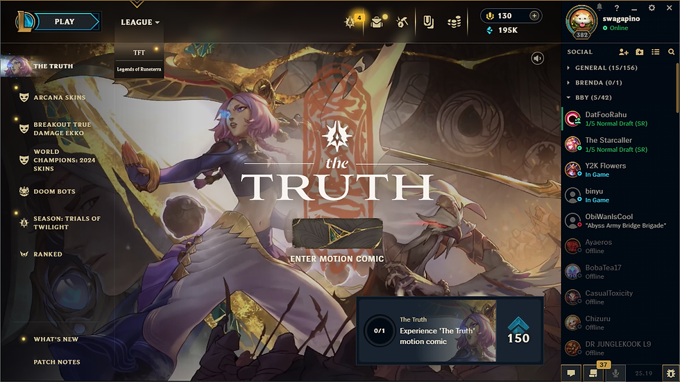
After signing in & launching it takes you to this screen above. While all the information is organized, there are some things that feel unclear, or feel off. For instance there's an option for League, TFT, & Legends of Runeterra (LoR) all next to play, while TFT uses the same client, it's fundamentally a different game, instead, I had it turned into a drop menu to save space. There were also too many icons in the top right, so I decided to remove the one gameplay related one, which was moved to the game selection spot.
In the bottom left, the notification for "What's New" sat awkwardly in the middle, so I adjusted it, they'd highlight properly now.
Start Screen

After selecting Play in the top left, it takes you to this screen, containing a lot of information but some of it is confusing, especially placement wise. I sought out to make some adjustments here with 3 main things. Cleaning up both the main header & sub header again, what's offered here, and the flavor text.
I started with adapting the previously made main header, into this page, and the proceeding pages. I cleaned it up since Co-op V.S. AI was considered apart of training, I included it there, removed TFT as it is just a different game entirely, and adjusted the spacing likewise for the sub header. With the introduction of a dedicated TFT Tab, I decided to put clash here instead. I made the icon to match, and adjusted all the flavor text to include the player amount, and for the one unique case, what's currently available. I also made a minor adjustment and added some extra text to each game type to make it so that it's more accessible and explains the differences between modes.
Game Selection

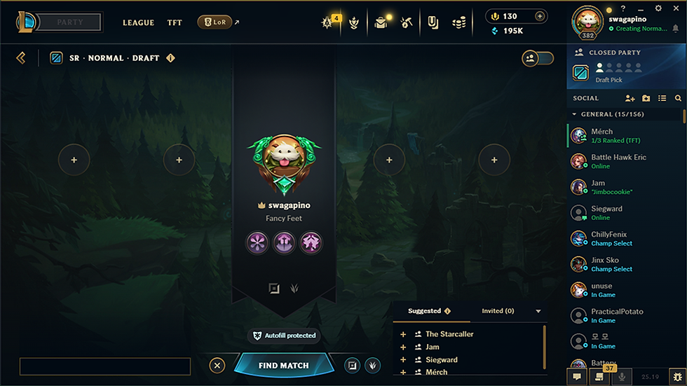
I wanted to adapt both a customization update that has been in discussion for a few years as well as some standard UI cleaning and optimal general chat adjustments.
I think adding the customization of adding the hero you want beyond just your profile, into a banner for everyone in your lobby to see is a very nice and visually appealing quality of life. I also added the lane selector, similar to the previous one, but a bit more modernized. It felt unintuitive considering the fact in quick play you select your roles in your banner but in draft pick you select it in the bottom right. I also wanted to add a small thing on the right that can tell you if one of your friends is in another game, such as light pink for In Valorant. Would be consistent with other game types, just a larger visual indicator versus the standard blank profile and in-game. Lastly I added the open and closed party button slider into the actual party section so you can adjust it on other screens as well.
Lastly I added the new main banner to pull the whole look off a lot cleaner.
Lobby

If I had more time to create, I'd develop more of an overhaul to the whole client itself, however in any case with a live-service, adjustments and feasible additions go a long way. I also wanted to add more of the other riot games to showcase like LoR and 2XKO, but as of designing these, it was primarily Valorant. I especially think the profiles and the player inventories need an overhaul of how to access the information.
I learned a lot from designing pieces in a system in place already. While functional, a little to ensure that the whole client is properly used goes a long way. A better client means a better experience.
Reflection
bottom of page