TFT : Creative Clash
OCT - NOV 2025
Teamfight Tactics Visual Identity & Website

Overview 📝
Amongst the ever-growing Riot Games library, includes Teamfight Tactics(TFT) , an auto-chess strategy game based on the League of Legends Franchise. It was grounded in combining ideas, utilizing assets, and the visual branding to match the ever-evolving thematics. Inspired, I wanted to create my own Designs based on Arts, Crafts, & Creativity.
Methodologies: Logo, Icon, Color, Typography, Web Design
Project Lead
Game Design
Web Designer
Creative Direction
Project Type
Adobe Photoshop, Adobe Illustrator, Framer
🔧Tools
VISUAL DEVELOPMENT
Logo, Icon, Color, Typography


The theme of this set is tied to the core identity is directly tied to TFT itself, the idea of being inspired by another piece of artwork, hence I wanted to use two colors that support each other; a deep blue that symbolizes creativity just like the 100+ item concept, and then a jade green that symbolizes rebirth; a change of thinking and re-approaching standard character designs.
I wanted to establish that these ideals go hand in hand, hence a gradient to connect them, and created a matching background to connect the theming all together.
WEB DESIGN
Framer, UI
Competitive Analysis 🔍
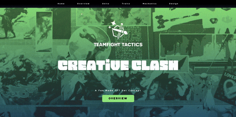
For this project, I created a fan-made website for TFT Creative Clash in Framer with an emphasis on visual consistency and game-inspired branding. I began by building a detailed style guide that defined the color palette, typography, spacing, and UI elements. I then referenced TFT-adjacent sites such as the official Teamfight Tactics page and MetaTFT to understand how they present information and use visual hierarchy. This helped me shape an experience that feels aligned with the TFT universe while still reflecting my own design direction.
From a UX perspective, my goal was to make the site easy to navigate and readable across different types of content. I designed the layout section by section and refined it through interactive prototyping. This process helped me identify moments where users needed clearer structure, smoother transitions, or stronger visual cues. I focused on consistent components, intuitive spacing, and accessible text contrast so users could move through traits, units, and mechanics without feeling overwhelmed. The final result is a cohesive and engaging experience that highlights both the Creative Clash concept and my ability to translate a style guide into a functional web interface.
Reflection 💭
-
Graphic Design: Building the style guide first helped me define a clear visual identity and maintain consistent typography, color, and components throughout the site.
-
UX: Iterating through interactive prototypes showed me where users needed clearer hierarchy and smoother flows, which strengthened the overall readability and navigation.
-
Framer: Working in Framer taught me how to translate static design rules into responsive layouts and animations that feel polished without slowing the experience.